Hey guys, my name is Brave Tomato, and I have returned from the post-making dead to bring to you some miscellaneous items and assorted goodies from within the Poptropica files, shared courtesy of Pop glitcher idk.
This collection is all about icon designs for Poptropica Worlds, some of which we’ve seen multiple times, and others that are never-before-seen. Let’s take a look, shall we?
Among the first batch, there’s a strange lightning bolt symbol and crystal symbol. There has not been anything associated with these symbols in menus of Poptropica before, which makes their presence here curious. The closest thing I can associate with the crystal is Realms, but there is a likely chance I’ll be wrong. Only time will tell.
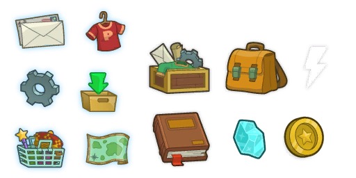
Here we also find what appears to be costumization button. This begs the question of whether the Creators are going to implement a Costumizer feature any time soon. After all, it has been a highly requested feature for Poptropica Worlds since day one, and already, players are missing the ability to steal that nice-looking shirt from some random guy on Main Street. How soon that will be is still up in the air.

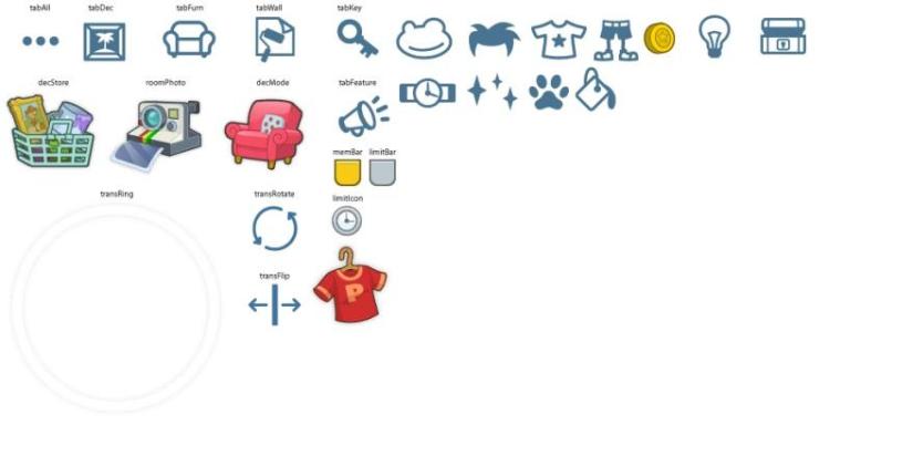
There are also some icons that appear to have originally been planned to be used for the home decorating aspect of Worlds gameplay, including an ability to rotate or flip objects. We do have a rotate option in player homes that looks similar, but it’s only two-dimensional: we can’t, for instance, make a couch face the TV.
I feel like the flip aspect would have been very useful for any of the furniture, and the rotate would be cool for pictures hanging on the wall or anyone looking to make a topsy-turvy house. Whatever the case is, what else will come of this completely new aspect of gameplay?
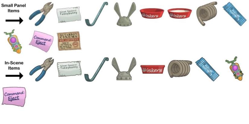
Finally, among a collection of items from the new new 24 Carrot Island, the files also show some unused items. Among these are the curiously absent teleporter to the outside of the factory that was in the original 24 Carrot, and a post-it note with “Command: Eject” on it. The cinema ticket also looks different.
Why these were not included in the game is probably a matter of refining during the creative process of making the island, but it is still cool to see what might have been.
So with these findings, we not only get a high-definition look at some of the icons and symbols within Poptropica Worlds, but we also get to see stuff that did not make it in the game. From there, it allows us to draw our own conclusions on what could have been, or what might become in the future. Although things in Poptropica have been more… spontaneous than usual, there is still an instinctive curiosity to make guesses based on what we know.
Speaking of icons, we’ve recently had a makeover with the one that represents our Poptropica Help Blog site! Taking the iconic Poptropica blimp design to fit the letters “PHB,” Slanted Fish put together this new one, hoping to capture the Poptropican spirit of adventure. Although we’ve been using our classic blue-circle, white-lettered icon for years, it felt like time for a change, and we hope the new one tells a better story!
![]()
Until next time, BT out!

Sweet!
Looking forward to being able to customize that random guy’s shirt on mainstreet again xD. That Carrot Transporter redesign looks sweet, it’s a shame it remained unused. I guess there wasn’t much of a point to teleporting to the Carrot Cake Factory’s entrance, I don’t recall ever really needing to use it even in original Poptropica ^^’. The eject command is kinda dark when you think about the original version of the final scene – nothing like ejecting Dr. Hare into the cold expanse of space. The sparkle and paw icons may be a hint to the release of powers and followers, but that’s my guess.
nice
where do you find the lightning bolt and crystal?
These images were extracted from the game files and are not used in-game.
Geez creators stop hogging all the good stuff #notmypoptropica
The new icon…could use a little work. I like what you tried to do there, Fishy, but the overlap of the blog name and the original image feels a little….unprofessional.
Hmm… I think it’s readable, if that’s the concern. The overlap was an attempt to play with the shape of the blimp with the shape of the letters, but if you find it lacking, what do you suggest?
The overlap is fine, but it coincides with the original. I suggest removing the parts which don’t mesh together (f⎌or example the reversed Poptropica logo on the blimp).
Personally, I find it more cohesive with the outline of the original graphic hinted at in the background, so it fits in with the letters. However, I made this for comparison:
In any case, it’s going to be shrunk down when it’s used as a logo, so the details (or lack of them) are not too observable. What matters more is whether it still looks fine when shrunk, and personally, I think it still works either way. 😛
Right now in the Poptropica community the best Glitcher in my opinion goes to IDK! First of all he made the item card ASGs! Second he digs into game files and leaks out information! Amazing IDK keep glitching because you are awesome!