This is a guest post by Silver Shell. Enjoy!
Hey Poptropicans! Today I’ll be talking to you about how Poptropica should first work on what we players specifically ask for, before jumping onto something else that they only think we might like.
Granted, this one’s a little obvious, but I feel like someone needs to bring it up. Poptropica often makes a ton of new features nowadays, and I feel like most of it is really unnecessary. Specifically, Poptropica seemingly enjoys replacing and changing perfectly good features. I’ll be addressing some of them here.
Not only are most of the new features pretty annoying and inconvenient in my opinion, they also bring up more glitches than the original version had. This is bad for both the players and the creators, since they have to spend even more resources on fixing the glitches, when they could have avoided all this by simply leaving the feature the way it had been. Here are some examples:
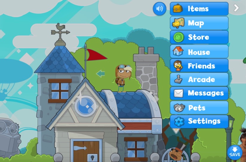
A Buggy New Inventory
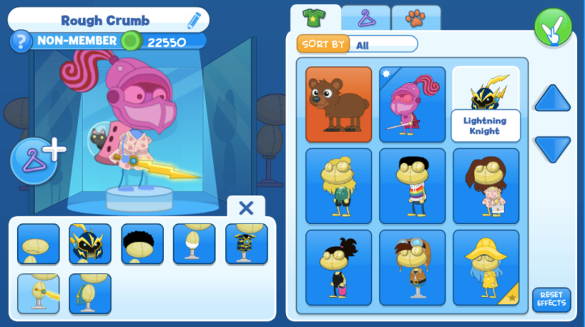
New and current inventory 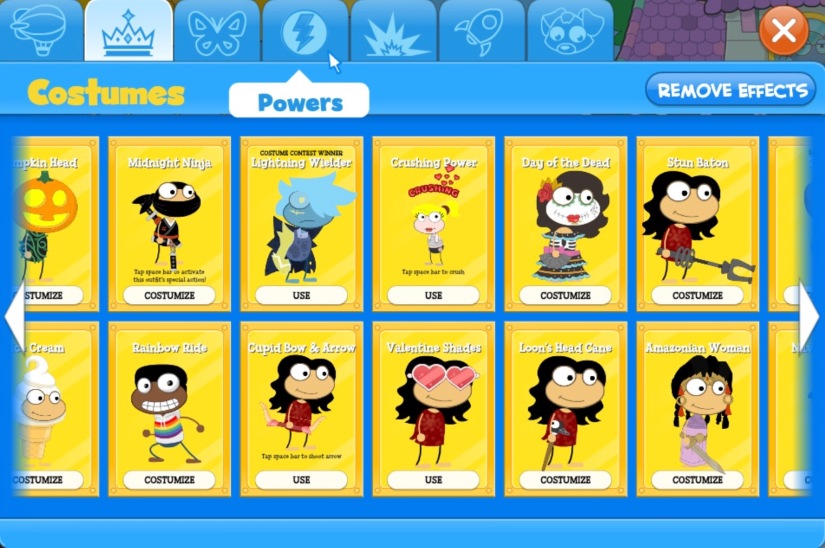
Previous inventory
This one has been brought up a lot. For a long time, Poptropica’s inventory screen has looked similar to the above picture to the right (though the categorization of items with tabs came much later). Earlier this year, it was changed to the one on the left. The original had very few bugs, and there was hardly anything wrong with it, especially once tabs were introduced to help sort through tons of items.
However, once it was changed to the character screen, even more bugs came up. People have been complaining about bugs on the character screen for a long time, but few are fixed. My theory is that the creators hear these complaints, but have already invested so much on changing the inventory setup that they are lacking the resources to fix it.
Loss of the Charming Crate Menu
New and current menu 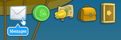
Previous menu with crate opening up
Remember the crate menu? You’d click on the box in the top corner to open up all the menu options. I know I definitely loved the crate. It was subtle and charming, and it was satisfying to watch your items just spill out across your screen. For another thing, it didn’t take up a lot of space like the new one does.
But when it was changed earlier this year, it was a boring modern 3-lines button. Not very fun at all! Not to mention how much space it takes up when all nine blocks are set out on the screen. I just think there was no real reason to change it. And it’s not like we couldn’t have the original in Haxe, since it had been there in Haxe’s earliest stages. Why did the creators feel the need to change this?
Home Island Refreshed, Again
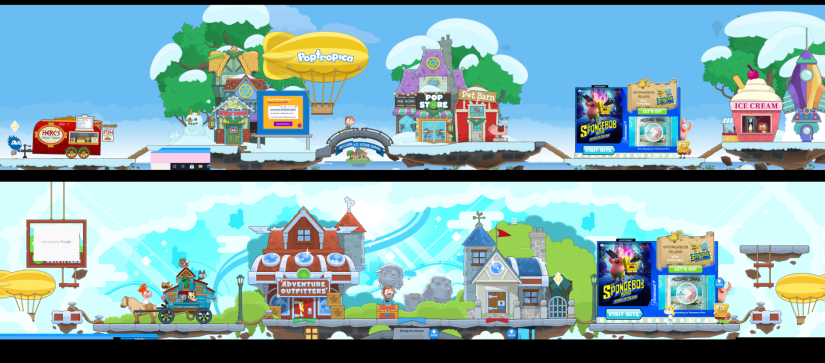
Some people like this new Home Island, but I have to say, I enjoyed the old one much better. I don’t see any reason in changing it — the creators should stop working on new Home Islands for a change and start working on classic island returns! They’re what we really want.
Speaking of new visuals, I’m also not a big fan of the new animation of characters, but that’s getting off-topica.
With all that in mind, this is my message to the creators: Stop replacing good features, and work on what we players specifically ask for!
The game wouldn’t be much without the players, but in its current state, it barely resembles the Poptropica I used to play. Creators, if you listen to our petitions for old stuff, Poptropica will really improve! So please, stop changing what is fine the way it is, and start working on what we really want — specifically, island adventures.
That’s all for this post. Thanks so much for reading about my ideas for what Poptropica should really focus on!
Pop Nonstop,
Silver Shell 🥈🐚
Hope you enjoyed this guest post by Silver Shell. If you did, you might also like other posts of hers, such as this Pop 5 list of Most Missed Old Islands.
The Poptropica Help Blog welcomes interesting Poptropica insights from anyone in the Poptropica community with thoughts to share. Interested in writing for the PHB? We’d love to hear from you!
