Hi Gs,
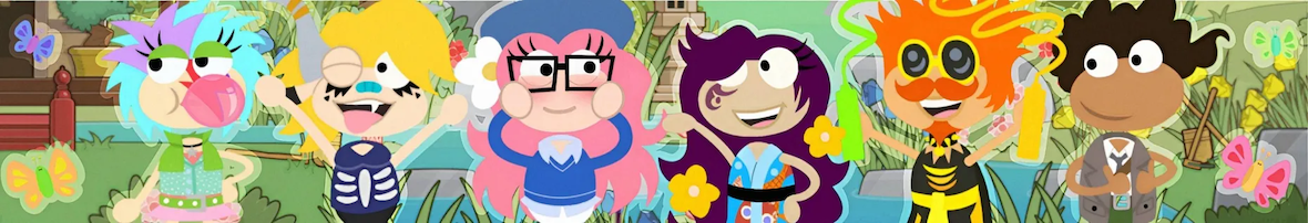
So, I assume you’ve already seen the new Poptropica homepage. (Check out Blake’s PHB post below for a recap!) I honestly think it’s smexy, but that’s just my opinion. Some people like it, some do not. Either way, I want to go over it with more detail in this post, talking about the little things that they have improved and changed. First of all, they’re definitely going for a more stylized look with the carousel slots – a lot more designing has gone into those, as you can see below.


Second, they seem to be going for a different look entirely with the clouds instead of palm trees and vines – the contrast works great, and I absolutely love the change. They also have finally updated to the new logo with the more bold and “poppy” style. I adore that thing, and if you look closely I put the same style into a lot of my graphics as well.

In the files, the change is labeled as “PopV2”, and contrary to my prior assumption, it’s not just an overlay, it is an actual update. Basically, I thought that they had just stuck all the new stuff over the old stuff. Instead, they have actually woven in the new stuff.
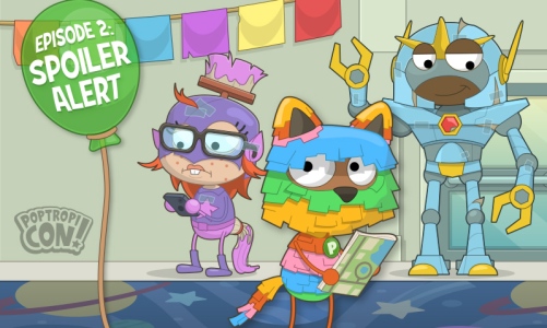
One last thing to say – I found this carousel slide for PoptropiCon: Episode 2. The episode came out quite a while ago, and I can’t imagine why they would release the slide anytime soon (perhaps they’d planned the new layout earlier but didn’t have it ready when P-Con Ep. 2 arrived). However, it’s a cool piece and I’m glad it was uncovered!
 Anyway, tell me what you think about the changes in the comments! I suggested that the Poptropica logo be animated to float – what do you think that the homepage needs?
TAFN.
-HPuterpop

I havent played for so long
huehuehue
There is supposed to be a yellow button that says “play now” but it will not show up for me. What do I do?
HP can you tell me the shirtless glitch
I have a shirtless guy in my closet I’m pretty sure (puterpop). I don’t know if you can costumize him or not, but you can try! 😀
I do like the “poppy” text effect in the logo as well and recently figured out how to imitate it (for anyone wondering): by adding a stroke (outline) and blue drop shadow, rasterizing the layer style, then adding another stroke to have it go around both effects. 😛
The news carousel designs are nice (plus, Shaggy Tornado is on one of the shirts! 😀 ), but I miss the simplicity of being able to log in straight away – having the news carousel shown after logging in would have been better.
Agree with that, Fishy! I would think that it’d be better if the news would come out on the loading screen so the player would not be that bored. We already had the carousel on our home screens but I also think that it’s nice to have something new.
I agree Fishy it kinda awsome with new effect.
What do u mean play now doesn’t show up? What is there instead?
Is still there try again
I really don’t like the new thing. I need to search poptropica login on goggle, it is terrible.